Thursday, December 9, 2010

Point: Explorations

As we concluded the class earlier this week we were asked to evaluate the class, and what we had learned. We were asked to draw comparisons between the various exercises we were given such as the counterpoint and point exercise. It was quickly summed up that those two in particular were used as methods of getting us to evaluate the material we had been presented, and to express our own understanding, and take on it. I appreciate this opportunity. It allows us to engage with the topic, and to grow as designers as well as humans in general, causing us to open our minds, explore the possibilities, and make our own mark on society, while carrying this knowledge of past precedents with us.

I think it's an interesting notion that with as far as we have come with architecture in our current age of modernism we still at this stage continue to produce cookie-cutter style homes for the masses. It is saddening to me to think that with the design minds we've had and still have that this is the case. I hope that the designers that come out of the program at UNCG will take strides to change this; to leave their mark. I know that the instructors lead us with the hopes that, that will happen, with a “no nostalgia” frame of mind and design.

I do however appreciate the structures as we advance; the ingenuity, playfulness, and creative bent. I suppose if it were on every street corner, however, we might lose appreciation for it.

http://www.thefeltproductive.com/2009/03/poster-modernism.html

The image I chose with the shapes and colors to me relates to the different styles that we now see next to each other. They do not relate to the one next to them, instead they stand out. This reminds me of the lecture when Patrick was talking about how we see modern structures placed in between structures of the past and they have no congruency, no consideration of the structure next to it, instead it looks as though it has just been stuck there.

The image also delighted my heart simply because it was produced at the Glasgow School of Art and is a reinterpretation of color theory of Wassily Kandinsky. Seeing as we learned about both the school, and also Kandinsky as a designer and artist, I found it fitting.

In turning back to the notes from the beginning of the semester I want to bring things back Vitruvius’ idea of commodity, firmness, and delight.  “In architecture, as in all operative arts, the ends must direct the operation. The end is to build well. Well building hath three conditions: commodity, firmness, and delight.”- Sit Henry Wotton Let me remind the reader that commodity is the function fitting the purpose, firmness is stability, and delight is the experience/culture/location of the structure or design. It is important that we remember these values, and carry them into our designs as we move forward. We cannot forget the past as we proceed into the future. The foundations that we began with still influence our culture and society today. The ground rules were set for a reason. Certainly to be modified, and one’s own interruption to taken from it, but at its core these rules must remain.

I’m reminded of something Patrick said in class "Looking at the world requires you to be in it." He is absolutely correct.  We as designers, and humans (the ones inhabiting the spaces being designed) must be present in our world in order to impact and alter it. Without seeing what is in front of us, and understanding the cultural context we cannot fully embrace our world, and ourselves as a society.

Counterpoint: Machine


Reading Comprehension: Seven


Actual "Sussex" piece.


Electromagnetic Fall


Wednesday, November 17, 2010

Reading Comprehension: Six

[1] A common theme of the early twentieth century found in Roth, Harwood, and Massey set the tone for an understanding of styles in architecture and design influenced by fine art. Selecting either Arts + Crafts or Art Nouveau, TRACE the influences of the selected style in more than two nations. In your answer, you should include evidence from the readings and at least two annotated images as support for your analysis of influences.

“Despite its individual manifestations, Art Nouveau design displays some common characteristics. Line, whether curving and sensuous or straight and geometric, is an important principle that designers explore and exploit... Designers reduce traditional and naturalistic forms and motifs to their essence, transforming them and ascribing to them their design intentions in appearance and meaning. Expressions strongly emphasize decoration, particularly surface decoration, which may be linear rather than plastic” (Harwood, p.485).

“To an even greater degree than others before them, Art Nouveau designers see no separation between the fine arts of painting and sculpture and architecture and the decorative arts, such as glass, ceramics, and furniture. They strive for unity in design to create complete expressions, or what they call total works of art” (Harwood, p.485).

While short lived it still managed to dominate the arts in Europe and the United States during the late 1800’s and early 1900’s.  Art Nouveau emerged first in France, and moved to Belgium where Victor Horta, Henry van de Velde, and Gustave Serrurier-Bovy were the leading designers. It can also be traced to Scotland (in some parts), Germany with Bauhaus, Austria, Spain with Arte Modern or Modernismo as it was referred to as, and Italy during this time, and later moved to England and the United States. It makes its way through these countries through the widespread exhibitions.  The United Kingdom to some degree, however rejected it, and was only accepted in some parts such as Glaslow with the practitioners Charles Rennie Mackintosh, Herbert McNair, and sister Margaret and Frances MacDonald. The U.S. was also somewhat apprehensive except in places such as Chicago with the Chicago school.  Tiffany glass was born out of this movement with Louis Comfort Tiffany and Tiffany Studios.

(p.34 Massey) Victor Horta, Tassel House


(p.58 Massey) Charles Rennie Mackintosh Library; Glaslow School of Art

“Art Nouveau lays important groundwork for subsequent modern movements in its attempts to throw off the past, its stress in total works of art, and its emphasis upon new technology and contemporary materials” (Harwood, p. 484).

[2] Originating at the Bauhaus and in the work of LeCorbusier, the so-called Modern movement deeply influenced design and architecture of the twentieth century. The great debate raised by this new approach to design involved the presence of the machine in the design process and final products. SPECULATE about the implications of “machines for living” and the famous dictum “less is more” on design today. Use at least one ARTIFACT, SPACE, or BUILDING in your answer, providing a salient image (cited) and annotation to help bolster your argument.


“Turning away from symbolic allusions and national building traditions, the purely pragmatic and utilitarian approach to design was to let functional requirements and structural solutions determine the result” (Roth, p.520).

LeCorbusier argued that “twentieth-century machines possessed the same elegance of form and function” as the Parthenon (Roth, p.530).  He also “extolled the mechanical perfection of the modern airplane, steamship, and automobile as supreme expressions of the beauty of from determined by absolute response to modern function” (Roth, 530).

With the example of the Citrohan house named after the Citroen, a popular French car he “hoped that such houses, using standardized factory architecture components, would be as easy and cheap to build as low-priced automobiles and, similarly, available to everyone” (Roth, p. 530). This did not quite happen, in that it was much more expensive and unattainable by the masses. The point is that it was the hope, the desire for the new design wave to be affordable, somewhat mass-produced, and available to all to be enjoyed. It was not practical. The same can be said for today. We are currently trying to become sustainable and have been for decades. The problem is that it is not yet mainstream affordable. We have certainly made advances and made certain things available to masses, especially with the given tax breaks when using “green” or “eco-friendly” products or renovations to your home or business. We are still living out this ideal of making new innovations available and inspiring.


(Roth p.530) LeCorbusier, Citrohan House

“The ultimate aim of all visual arts is the complete building…Together let us desire, conceive, and create the new structure of the future, which will embrace architecture and sculpture and painting in one unity and which will one day rise toward heaven from the hands of a million workers like the crystal symbol of a new faith” (Roth, p.523).


[3] From the assigned pages in Roth, Harwood, and Massey, SELECT an image that you believe explodes the notion that Modern interiors and objects were black and white. Fully RENDER your own design exploration of that image through color, material, and light and appropriately annotate and cite the image to prove this point. [5 POINTS POSSIBLE]


(Harwood p.604) Ludwig Mies van der Rohe, Tugendhat House

Thursday, November 11, 2010

Reflections Summary

Raul Garcia tied many of the elements from the unit together, and in most cases spoke eloquently on the subject but faltered with minor grammatical errors in areas. By drawing many correlations he made the subject matter relatable, and drew better connections.


Jasmine Collins spoke very clearly and distinctly about individual forms of architecture, and related them each to the other. She had excellent transitions, vivid descriptions, and supported her points with rich quotes.


Jenni Ham chose a beautiful image to tie her piece together. She has great usage of cultural context. I have not seen this in other’s writings, she brings a new level of understanding to the material/subject matter. I appreciate the difference in her writing as compared to other's.


Through the exploration of each post I gained better understanding of the unit, or was reminded of information that I had forgotten. This exercise of critiquing our peers work was helpful in bringing about different points of view and discussions for us each to gain another perspective and understanding.

Alternatives Summary

 Kacie Leisure draws interesting, well composed links between subject matter and examples of architecture.  The image she chose works well for unit taking from previous technology/design and revolutionizing it, changing it to suit cultural needs.
www.kacieleisure.blogspot.com


Kathernine McCain has excellent points and observations. She makes connections across the entire semester bringing things together and more tangible.
http://fullcircledesignblog.blogspot.com/


Weston Willard point is eloquently written. He provided excellent examples and correlations. I didn’t fully feel the same way about the image chosen, however. But over all he broke down different the elements successfully.
http://wweston.blogspot.com/


Each had a different focus and understanding of the material, but each helped me to piece together elements of the unit, and take on a different perspective. It's interesting to explore the different writing styles, and realize how different the information is processed individually. 

Monday, November 8, 2010

Counterpoint: Clock

This counterpoint took place during the reflections unit. I chose the Hall of Mirrors in Versailles. I demonstrated reflection through the use of a mirror also showing materiality of the actual structure. The mirror reflected the symbolism of the sun god and the fact the King Louis thought of himself as the current sun god. He brought elements into Versailles to reflect this with the gilding, the mirrors reflect the windows also reflecting the sun. I implemented that into my 3d model as well. 

3D-Space
Nature- Sun reflecting from windows, and the clouds in the image being reflected.
People- Scale figures walking through space.
Material- Glass/Mirror, flooring
Symbol- Sun God


Sunday, November 7, 2010

Point: Reflections

“It's just a jump to the left, and a step to the right...Let's do the Time Warp again!!!” Patrick quipped in class about doing the Time Warp. After recently see Rocky Horror Picture show over the weekend at the Carolina Theater I realized how perfect his statement truly was for this unit. This unit was all about looking to the past and recreating, modifying, and even revolutionizing.

Patrick provided a slide in his lecture a couple weeks back drawing a comparison throughout many of the design cycles. It was depicted as a pinwheel of sorts with “Revolution” at the center and various terms with subcategories off shooting from the center. Those included Renaissance: the revival of learning and culture, further described as rebirth, transition, and changeover. Revival: coming again into activity, renewal, reclamation, and rehabilitation.  Rotation: uniform variation in sequence, circumvolution, rhythm, and flow. Cycle: a recurring series of events, series, sequence, and phase. Reform: a change for the better, straighten, regenerate, correct abuses.

This to me was exceptionally helpful in understanding how everything responds to the previous, and continues to build upon itself. Few things have truly broken free from past precedents; in fact it may be argued that nothing is truly ever new.  We continue to work out the kinks or problems of previous works. Although I believe once we made it into the more modern style period we were no longer recreating the past per say in a 1:1 form with exception of what we saw in Chicago with the city built meant to pay homage to Columbus, but instead we were reacting to the past and improving it. We improved our technology with the emergence of the railways which brought with it new materials to build with (iron and glass). This revolutionized the face of architecture, or rather the bone structure for lack of a better term.  While this was happening however we still had Victorian, and Arts and Crafts speaking. Homesteads still looked to the past as commerce and buildings associated it with it were looking to the future.
It became clear during this unit that it is difficult to define modern and modernism.  The free online dictionary defines modern architecture as a “new architectural style that emerged in many Western countries in the decade after World War I. It was based on the "rational" use of modern materials, the principles of functionalist planning, and the rejection of historical precedent and ornament”(http://encyclopedia2.thefreedictionary.com/modern+architecture). I do not believe you can truly define it, it is always changing, always reacting to the current culture.


http://www.southbayshipping.com/2005Modernarchitecture53.html


Again, going back to the time warp statement…the image I chose represents time shifting, being mixed together, coming together to create one image. The image reflects modern architecture being swirled around. To me this represents the idea of many ideas or languages coming together, the lines of separation blurring, responding to what is happening around them taking components from each to unite them into one composition creating a new genre.

“It's astounding, time is fleeting
Madness takes its toll
But listen closely, not for very much longer
I've got to keep control

I remember doing the Time Warp
Drinking those moments when
The blackness would hit me and the void would be calling
Let's do the time warp again...”

Wednesday, November 3, 2010

Reading Comprehension: Five

[1] From the Roth, Harwood, and Massey readings, select an ARTIFACT you believe to represent revolution in design. SPECULATE about the type of revolution this artifact symbolizes. Supplement your answer with a beautifully hand rendered image of the artifact you selected, citing source and page on your image. [10 POINTS POSSIBLE]

I chose a chair on page 26 of the Harwood book. The chair has language of a revolution in design, and ingenuity. It introduces mechanics representative of the machine/industrial age. With the introduction of the railways/trains technology took a new path along side it, riding its way to greater and better things. Prior to this time in history furniture was stationary within itself. With this chair in particular it not only can swivel from side-to-side, but you can also adjust the height of the chair to fit yours. While the chair has four legs, they are not traditional legs, they are modified and have a distinct shape. There are no arms, which is not traditional. Over all I believe the design is forward thinking. It is thinking more about function vs. high style and merely having something in your home to show status, and wealth. These were all new ideas of the time period, no longer looking as much to the past, and therefore revolutionary. 

[2] Using the internet, LOCATE and ANALYZE an image for an ARTIFACT, a SPACE, a BUILDING, and a PLACE, drawing the idea of eastern influences as understood by nineteenth-century minds (China, Japan, India, Middle Eastern) on western design and architecture. Each answer must include an appropriately annotated and cited image in addition to a well-crafted essay to defend your choice of each image and the ways (more than one) that the material item responds to design influences from the east. [20 POINTS POSSIBLE]**


During this time period Europe was borrowing Asian influence from China, Japan, India, and the Middle East. This was when the silk road trade route was established. The Asian cultures' design had refinement, elegance, and long tested forms of art being one of the oldest cultures. The Europeans were now incorporating those ideals into their own.

Artifact


https://www.invitinghome.com/store/product.php?productid=20703

This is an example of Chinoiserie design. The imagery alone depicted on this piece of furniture is of an Asian garden which is a prime example of Asian influence. Also the use of legs elevating the object is a new introduction to European culture from the Orient. Previous items sat directly on the ground, in this time it showed cleanliness, and space with the elevation of the furniture on legs. The gold leafing, and intricate design has not been seen prior to this time either in the manner in which it was executed with this piece.

Space

http://www.sageworks.com/portfolio.htm

The wallpaper combines real elements with fantasy which is a direct influence from the Orient.The floral patterns, and the choice in color is of equal influence. This has not been previously seen until this design period.


Building

http://www.hamiltongardens.co.nz/index.asp?PageID=2145837919

It was now of importance to provide gazebos and pavilions in European garden spaces. They acted as a mixture of romanticism, nature, and fantasy. This one in particular resembles the Chinese palace design type. The coloring no longer depicts the old world of Greece, Rome, or Pompeii, instead they were embracing the old world of the Orient. This in my opinion is bringing about another wave of classicism, just in another form, another culture. Europe was still borrowing ideas and modifying them. I question if we will ever lose the classical language, or design influence, or if we will always be trying to recreate the past in some way.

Place


I believe this structure is marrying classicism with the design elements of the Orient. Sanssouci has gazebos on the grounds as well as expansive gardens. These were new introductions.


This building is called the Dragon House, located on the northern edge of the property of Sanssouci. The designer referenced architectural books on the topic of Chinese buildings when developing plans for this structure among the others. This structure in particular again parallels the Chinese palace design type.

The video link below is by Rufus Wainwright, an artist I've enjoyed for some time now. He sings about the place above..Sanssouci. I thought it would be an interesting addition to this post. Enjoy! =)

http://www.youtube.com/watch?v=0QRu6Ck0e3g


Thursday, October 28, 2010

Counter Point:Perspective

With this counterpoint exercise I chose "Word" as my form, and "Building." I chose the Salisbury Cathedral. The word I chose was "Verticality" for the purposes of explaining the over -all design of the gothic cathedrals. The point was to reach towards Heaven, to be close to God, to make man seem small in comparison (a sign of humility, a desired trait among Christians). I chose a few perspective views of the interior, as well as one image to depict the exterior view showing the spire, the arches, and the over design. That image also included nature, and its setting among the landscape. I showed symbol in the plan view showing the double cross, of course symbolizing Christianity. I showed people worshiping in the space. I also chose an image to show materiality when depicting the cloisters...concrete. Stained glass is also shown as a material in the pictorial view of the interior of the cathedral.

Monday, October 25, 2010

Point: Alternatives


Prior to today’s class I had hit a wall in writing this point. While I understood the basics of the alternatives unit being the transition from sticking by the rule book to taking the rules and breaking them, I could not find a way to articulate it.

In the alternatives unit we covered material from the Gothic cathedrals up through the Rococo and Baroque style periods.  Each time period paints a very distinct image in ones head. The Gothic cathedrals most replicated the rulebook while still reaching to new heights, both literally and figuratively. They were able to expand on the rules, and modify them to suit their needs because for the first time in history there was a monetary backing for the construction on the structures. The architecture was able to reflect the ideals of the patrons, and of the church instead of society as a whole. The Gothic cathedrals were a symbol of the changing times during a dark part of history. It was a glimpse of hope for what was to come.

At a few points during the unit the topic of conversation was about the design voices that were speaking during these style periods.  The most influential was the voice of classicism, with mutterings of new ideas and influences. 

Moving into the Rococo and Baroque style periods it was more about showing society that they were refined enough to know the rules, yet skilled enough to know how to break them. They took the boundaries of the proverbial rulebook and extended them far past anything seen prior. Patrick used the example of the cartwheel during two class periods…You first have to move outside of the box, then move beyond customary behavior, then further stretch and move somewhere further. Your viewpoint changes as you move just as the viewpoint of society and architecture. You are first standing upright, you turn it on its head, and then you move back to an upright position. In a sense almost like history repeating itself, however, taking some things that you have learned and altering it; the rules shift slightly.

Something that resonated with me was the thought of static and then moments of great change. This thought transcends through many aspects of history, life, etc… It can clearly be seen in architecture, but also in fashion, as well as the human life cycle.  The Renaissance would be a prime example of this. Prior to it there was little new life being breathed into the world of architecture, and of art. Things were stagnant. With the Renaissance there was a rebirth. New ideas being generated, hope once again reestablished.  


http://www.shutterstock.com/pic-26423629/stock-vector-heart-pulse-monitor.html


imgres.jpg 
          Bellbottoms 

http://www.sodahead.com/fun/if-you-were-the-fashion-police-what-would-be-illegal/question-377297/?page=3


 Flare Jeans


http://www.w1style.co.uk/details.asp?productid=3615


The images above to me demonstrate the ideas of this unit clearly. First, with the heart monitor, the line showing both great movement and then flat lining i.e. becoming stagnant/stationary. This is much like the design world. We have our ups and downs, our plateaus, and then we pick back up again at a different rate than before. I also chose images of articles of clothing, the first image being bellbottoms from the 1970’s and then flare jeans from today. This to me speaks of the Rococo and Baroque time periods in how they took from the ideas of classicism, and tweaked them, made them their own, and surpassed previous style periods.  In the case of the images I chose the flare jeans took from ideas of the past (the bellbottom), and changed the rules. While keeping the bell at the bottom of the pant leg, they narrowed it. It made for a more sleek design, changing with the ideals of those wearing them. Much like the architecture changing with the ideals of society.


Monday, October 18, 2010

Reading Comprehension: Four

Alyssa Hankus
IAR 222
10/18/10

[1] Just as we learned with Gothic cathedrals, in the context of each PLACE, the other scales of analysis (ARTIFACT, SPACE, and BUILDING) each demonstrate difference. For each scale on the readings rubric above, EXPLAIN at least one common design language that links them all. Use the principles and elements of design as defined for this class in your response. Explicitly tie the Roth reading to your analysis, using at least one cited quote. [10 points possible]

[Artifact]
A common theme across the artifacts, spaces, buildings, and places is their classical language. Of the artifacts the Desk/bookcase, the Windsor chair, the Tall Clock, the State Bed, and the Sheraton Side Chair have intricacy, high ornamentation, symmetry, order, and classical language with the presence of swags, urns, and floral motifs such as rosettes and wreaths run rampant among all. "There were no classical ruins in the New World from which Americans could learn something of what made for good design," thus the new settlers drew from previous experience, and replicated what they knew; the Old World (Roth, p. 459).

[Space]
The Holkham Hall Saloon had high ornamentation, dynamic texture, contrasting wall patterns and upholstery with scale, and broken pediments (Harwood, p. 418). The Gunston Hall used stairs as an architectural element to be celebrated as well as to serve a function. The staircases unlike before became their own space utilizing symmetry, balance, repetition, and order. They made their own statement. This was copied in the Gardner Pingree House as well.  The Gardner Pingree house had subdued ornament as opposed to high ornamentation of previous classical language. It was taking on a new form. However, it maintained symmetry, swags, urns and other classical motifs. The Saltram House Saloon functioned as a parlor, was highly patterned, compartmentalized, and had a classical motif with its swags, symmetry, and a central arc window. Marie Antoinette's bedroom at Fountainbleau broke off from traditional classicism and introduced a sense of theatrics. However, it maintained order, except it was in a more chaotic manner. The eye has no safe place to land, and is constantly surveying the room. There were substantial amounts of high ornamentation.

[Building]
The Chiswick House was based on La Rotunda, but taking design risks, and taking further steps into forming complex geometric shapes. The building was not highly adorned or embellished, it had a sense of calm, focus on symmetry and geometry verses ornament. It embodied classism. The Drayton Hall mimics classical design through its doric columns on the bottom, ionic columns on the top, and its symmetry. However, unlike the Chiswick and how it took from La Rotunda with the superimposed circle on top the square base, the Drayton Hall placed a square on top of square. Its focus was on repetition, emphasis on entrance shown through the portico. St. Genevieve screams classical language taking from both Greece and Rome. It appears to resemble the Parthenon on base and the Tempietto San Pietro on top.  It has a large mass, and stature. The classic Corinthian order it interwoven around the structure, again speaking with classical language. The Nathaniel Russell House has repeating elements at different scales such as the windows. It appears to be based off of the Palazzo Medici, being that it appears to be built in three tiers going in order from public to private assuming your eye is moving from the bottom of the structure, upwards. Again, representing classicism.  Monticello, the home of Thomas Jefferson resembled both La Rotunda and the Chiswick House. It has an octagonal dome superimposed on a rectangular base. It has clerestory windows, a balustrade, symmetry, repetition, and axial progression.  However, it has more volume than traditional symmetrical architecture of its time. 

[Place]
Among all the places, London, England, Williamsburg, Virginia, Paris, France, New Town, Edinburgh, Scotland, and Washington, D.C. classicism was the common component.  Once there were settlements in the new world, and government was established, the ideals of the old world were still prevalent. People such as Thomas Jefferson took the ideas of Palladio and Vitruvius and implemented them into his own designs. Once the works of Palladio were published his ideas were borrowed and reproduced many times over. With that being said there were common threads among all of the settlements for that reason. People were reproducing the classics, with their own twist on them. By reproducing the classics is showed education, and status.


[2] Linked to Europe, the ARTIFACTS, echo closely their design forebears. Selecting evidence from all four scales for both the American Georgian periods, TRACE the common design ancestry across the Atlantic Ocean in the Neo-Palladian and Late Georgian periods of England and the Louis XVI/French Provincial period in France. ARTICULATE the implications of copying from Europe for the American colonies. Use the principles and elements of design as defined for this class in your response. Explicitly tie the Roth reading to your analysis, using at least one cited quote. [10 points possible]

[England]
Early design characteristics in Boston and New England America follow English medieval examples and were humble in scale, with a concentration on function verses fashion. An example of this would be the Parson Capen House. It relates back to medieval England, and its domestic homes with traditional framing methods, a steep pitched roof, a central chimney, small windows, and a plain exterior (Harwood, p.255). Another example would be the Hart house hall. It represents vernacular England with its medieval style. In this case it has a low-beamed ceiling, and its primary material is wood (Harwood, p.260). It has a simple/plain façade, and its main concentration is on function. The gateleg table was also of a medieval style, made of wood, and was simple in ornamentation on the spindles. It has functional use and can change size to add or subtract space (Harwood, p.264). Considering the fact that it was England that settled this province it directly influences the architecture and design. With them they brought their culture, and design concepts.


[Spain]
St. Augustine, unlike the buildings of the other colonies that were largely medieval Spanish buildings showed influences from the Spanish renaissance and baroque style period. An example would be the Governors palace, which resembled the adobe.  It had mostly Native American influences with a dose of Spanish. While the Spanish people settled St. Augustine, the Native Americans were native to that part of the world, and therefore their culture was also incorporated into the design of the structure. An example having more of the Spanish style influence would be the Columbus House entry. It has wrought iron, with an Islamic/Spanish influence. It has high ceilings, arches, and the use of tiles.  However, I find the use of the wood beam ceilings to be a representation of the ceilings found in the Great Halls in England. The artifact being the Fraileros was simplistic in its form and decorations, and had shallow carved ornamentation. The spindles are carved and flat rather than turned. This artifact is a pure example of Spanish style.

[France]
New Orleans was settled by the French in Louisiana. The settlement carried influences from the rest of the colonies, but with adaptations made by the French who landed there. It held distinct sophistication that linked to France. The Houssaye House follows medieval style but not as much as England. It is reflected through honest use of materials, function over style, a steeply pitched roof, and large windows and doors (Harwood, p. 292). It has two stories and exterior stairs, which were common as an adaptation to the warm, and moist climate. This is considered to be a Creole influence (Harwood ,p.294). The Parlange Plantation’s exterior has a Creole influence, and the interior has an aristocracy influence, a galerie surrounds both floors and serves as extension as the living service areas, and has partial elements of symmetry (Harwood ,p.292). The armoire is simplistic with its cornice, double doors, and plain façade. This is often found in provinces of France. It has curvilinear apron, but the remainder of the piece is lacking in ornamentation. (Harwood, p.302). It remains functional, but is also simplistically decorative. “Some French architects push[ed]…architecture of pure elemental form expressing function” (Roth, p. 447-448).

[Germany]
The Germans settled in different pockets of the United States when settlements were just beginning. One of those places was New York. With them they brought their medieval building and furnishing traditions. They produced distinct home styles (Harwood, p.303).  The Single Brother’s House in Salem, North Carolina carried the influence of the Germans with its log façade. It expresses the rural traditions of early settlement. It has a high-pitched roof letting us know of its geographical location being in a colder climate as compared to settlements further south (Harwood, p.306). Andrew Jackson’s House had a medieval influence, with multi-functional rooms. Like the Single Brother’s House of Salem, it also has a log façade, also expressing rural traditions of early settlements and westward expansion (Harwood, p.306, 310). The Shrank had clean lines, simple ornamentation and carving on its exterior. It was compartmentalized in such a way reminding me of the building style of the Palazzo Medici, but instead being in order of public to private it goes from private to public.


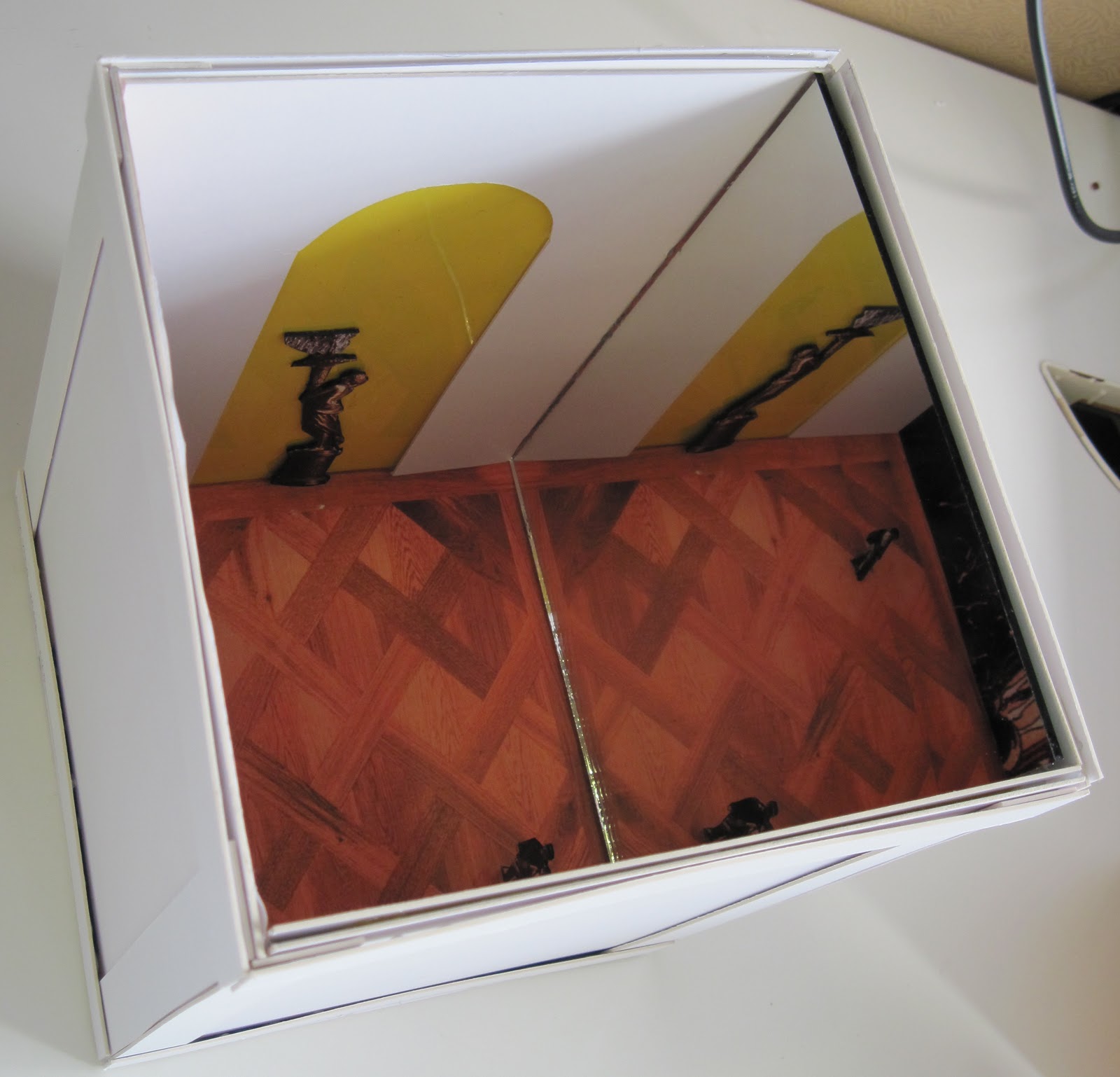
[3] From the Hersey/Freedman reading, DESIGN and POST a labeled floor plan of a possible Palladian villa inspired by Girolamo Frescobaldi’s Balletto Terzo found online at this site: http://www.metmuseum.org/toah/hd/renm/hd_renm.htm select the link on the left side of the page with Frescobaldi’s name under multimedias [5 points possible]


In taking from the ratios mentioned in the article I designed this floor plan. For the outer-edged space I kept a 4:3 ration. For the internal squares along the edges I kept a 1:1 ration, and for the rectangles along the center I kept a 2:1 ratio. My floor plan also keeps axial progression. I attempted to have a navigation of space among room used for similar tasks. For example the kitchen leads to both the dining area as well as to the porch should the occupants wish to dine on the porch. The bedroom leads to the library, and the library can also be entered from the foyer. The dining room leads to the salon for entertainment after dinner, and the salon can also be entered from the foyer.


The image is a screenshot taken from the link provided.

[4] Using the resources at the weblink below, SPECULATE about whether you believe that the architecture and design in the Baroque period stands as a form of social performance in the theatre of the world. Support your response with examples from class and the assigned readings. [5 points possible] http://fathom.lib.uchicago.edu/2/10701023/

It is evident that architecture and design in the Baroque time period were forms of social performance and theater. Based on the website provided I found the following quotations:

“It was of course at Versailles that absolute monarchy created its most spectacular and theatrical expression of power. The formal gardens designed by André Le Nôtre were not only a figurative stage for the court life acted out before the backdrop of the palace; they were also literally a site of the greatest theatrical productions of the period. The grand festivities organized under Louis XIV interlaced fireworks, floats, ballets, and re-enactments of chivalric games with original plays produced on stages harmoniously set in the gardens or courtyards of the palace” (Larry F. Norman, The Theatrical Baroque: European Plays, Painting and Poetry, 1575-1725).

“A world of light and shadow
--and in baroque art more generally--the effect of movement and action was more important than the effect of symmetry and balance that had dominated the art of the Renaissance. Baroque artists aimed to undo the classical unity of form and function, to unbalance the composition and achieve the impression of movement and space that the new age demanded” (Larry F. Norman, The Theatrical Baroque: European Plays, Painting and Poetry, 1575-1725).

With further exploration into Versailles, it was a statement of power, majesty, status, drama, lighting, movement, customized luxury, and grandeur.  It was built to symbolize the sun god, which Louis XIV compared himself to. In this time period sacred interiors set the tome of theatrical sets. With the play of the light with the windows, mirrors, and the gilded statuaries, there can be no denying the sense of theatrics.

Baroque comes from the term “barocca” meaning misshapen pearls. Gradually, the term became used in the late nineteenth century as more of a positive, descriptive word having to do with art that was elaborated, embellished, and complex (Roth, p. 398).  The Baroque time period was about taking the rules and breaking them, proving that they knew them, but also knew how to manipulate them. There was a lack of boundaries, and a spilling over the edges. It was full of excitement, ornamentation, and theatrics, there is no doubt.

Wednesday, October 6, 2010

Point: Foundations

Alyssa Hankus
IAR 222
10-06-10


With each new structure there is some semblance of the ones that came before it. “Past architecture serves as the blue prints for architecture to come. “ Of course we are given the choice to either duplicate previous works exactly, or to morph it into something else, still using it as a precedent in some way. With that we are given the idea of the prototype, the archetype, and the hybrid. I have had such an attachment to the idea of using previous architecture as a blueprint for a reason I cannot describe. I suppose it is because we are always paying homage to the past through everything we do, and with that we are holding the past close to our hearts.

While we have an eye to the future, we are constantly turning our focus back to the past. In the foundations unit this became clear. We saw examples of this through the transformations made from ancient Egypt through Greece, and then the Roman Empire. The common threads through each were the ideas of stacking, circles, and horizontal lines across the earth. These examples first started with Egypt and its pyramids. The Egyptians discovered new formations, sound structures, and genius methods of building.  They were able to create substantial structures, from materials indigenous to the area (sandstone, and limestone). Considering the mass the Egyptians had to use methods of stacking, done in a precise manner.

We then move to the Grecians who adopt the idea of stacking, however they implement it in different forms. An example would be their columns. In order to construct the individual column they must first form sections of the column and stack them into place. The Grecians created cylindrical columns instead of rectangular, thus altering the Egyptian design.

In the previous examples Egypt was the prototype, Greece the archetype, and Rome became the hybrid. Prototype is “an original type, form, or instance serving as a basis or standard for later stages”(http://www.thefreedictionary.com/prototype). Archetype is “an ideal example of a type; quintessence” (http://www.thefreedictionary.com/archetype). Hybrid is “Something having two kinds of components that produce the same or similar result” (http://www.thefreedictionary.com/hybrid). While Rome borrowed the ideas from Greece with the orders (Corinthian, Ionic, and Doric), as well as similar structures for their temples, they improved them, and made them their own. For example, the Pantheon of Rome and the Parthenon of Greece. Rome took the “blueprint” of the Parthenon and altered it, and perfected it with the building of the Pantheon. They perfected the use of concrete, and the dome with the coffered ceiling, as well as the manipulation of light that provided a mystical, humbling experience.


The image I chose was a blueprint paperweight that has been distorted from its original form. To me this sums up the idea of the journey from prototype through archetype to hybrid, the paperweight being the hybrid. Also much like the way Greece changed the use of the temple into a place of worship from the use of a burial place that the Egyptians purposed it as, the blueprint in the image takes on another use as a weight. 

Friday, October 1, 2010

Reading Comprehension: Three


[1] Compare and contrast the cathedrals according to the matrix. To illustrate your post, hand draw a view of your “main” cathedral, scan it and place it at the top of your response. Your written thoughts should fully illuminate the questions asked with each cathedral pairing on the website. Strive for 250- 300 words total for this response. Include additional images, as applicable, if you wish. Also check out the west vs. east page and digest what is written there (20 points).


Salisbury


http://www.oxfordtraveltours.co.uk/tours.php


http://www.trekearth.com/gallery/Europe/United_Kingdom/England/Wiltshire/Salisbury/photo840139.htm
Cologne


http://commons.wikimedia.org/wiki/File:Cologne_Cathedral.jpg


http://commons.wikimedia.org/wiki/File:Koelner_Dom_Innenraum.jpg

Inside/Outside- Cologne/Salisbury

The insides of the Salisbury Cathedral and the Cologne Cathedral are both very similar in style. They both have trussed/ribbed ceilings, arches, clerestory windows, verticality, rosettes, columns, traces/windows, stained glass telling stories, altars, and pews. Both have axial progression, and both have the shape of cross. They differ in that the buttresses leap higher in the Cologne chapel verses the Salisbury. The Salisbury has one spire at the crossing, whereas the Cologne has two at the entrance. “Towers with spires accent crossings. English cathedrals emphasize horizontally with bands of sculpture and stringcourses. They usually have shorter façade towers and fewer flying buttresses” (p. 148, Harwood). The Salisbury has cloisters, and the Cologne does not. “English examples often have flat eastern ends and more than one transept. Monasteries with a cloister may be attached to important churches” (p.146, Harwood).

The difference in their locations certainly bring changes in their over all structure. “Complex vaulting found in Germany, where the hall churches, with nave aisles the same height, are particularly characteristic” (p. 145, Harwood). These characteristics were not found in England.  Also, in the geographical sense Cologne has structures built up beside it, and the Salisbury has a courtyard surrounding it.  “Indicating their importance in town life, most Continental cathedrals are in the center of town surrounded by markets, dwellings, and other secular structures. However, lawns and tress surround most England cathedrals.”(p. 146, Harwood).


Amiens
http://chicagomontreal.wordpress.com/2007/07/11/amiens-cathedral/


Time- Amiens/Salisbury

Both structures began their construction at the same time in history. Both have Gothic historical language and context. However, Amiens took 190 years to complete, whereas Salisbury only took 38 years. Through the process of changing hands of both designers/craftsman and laborers the architecture changed for Amiens. Not only because of the thought process of the individuals but also because of the culture changing. Culture/location dictate the movements in architecture. Both structures maintain a sense of gothic history with their interiors with ribbed trussed ceilings, columns, and stained glass. Both hold rich history in their own right. Amiens may hold history from more time periods, but Salisbury is a tribute to one time period, being more dear, focused, and in my opinion more of a time capsule, and therefore richer.

I am reminded of something Patrick said in class, in that buildings are a blueprint for future architecture. One can either choose to make a reproduction of the original structure, or one can choose to alter it.  In the case of Amiens and Salisbury it is clear that Amiens used structures such as Salisbury as a blueprint, but instead of replicating it exactly, the craftsmen/architects altered the design, and incorporated “today’s” thinking along the way during construction.


http://www.ucalgary.ca/applied_history/tutor/endmiddle/art2.html

Patrons- Florence/Salisbury

It is incredible to think that the individual mindset of the patrons did not change the over all design of the Florence cathedral. I would have assumed that there would have been a substantial influence since it was their money provisioning the additions to the structure. I would have assumed that they would have had stipulations for how their money would be spent.

I have no issue with the patrons underwriting the cost of the structures. In doing so it is keeping government separate from the construction, allowing for it to remain strictly a place of worship without outside influence, other than cultural context of the time period in which the structures were built.

I think the patrons working together cohesively certainly brings greater understanding of how the structure of design or underpinnings work together as well. One builds on the other to create the whole. This is important during the Middle Ages because at the time there were not funds to draw on, it was a feudal society, and in order to survive they had to band together. This is still important to architecture today.  If there are too many hands in the pot, and people are not working together to accomplish a common goal, the final product would not be cohesive, and perhaps would never be finalized.

http://www.amazon.com/Medieval-Home-Companion-Housekeeping-Fourteenth/dp/0060166541


[2]This illustration from A Medieval Home Companion depicts woman at work in a medieval interior. Unfortunately, the image is closely cropped so we don’t see much of the rest of the dwelling in which she works. Using Harwood and Roth, complete the rest of the scene using words and images to demonstrate your understanding of the domestic medieval interior (10 points).


What we know of medieval interiors is that those in this time period inhabited one space that was not split into sections with physical boundaries, for example a great hall. There may have perhaps been a minstrel section above, but again nothing physical dividing the space on the floor. The woman depicted in the image may have been the lady of the house, or a servant. Based on her clothing, I would imagine her to be a servant performing household duties.

The society during the middle ages was a feudal one. The homes were built with heavy materials, much like a fortress. They were dark, and closed in.  The windows are narrow, and the doors are a dark wood.